preliminary project - final product
- Teodora Frunza
- Jan 16, 2025
- 2 min read

Updated: Feb 2, 2025
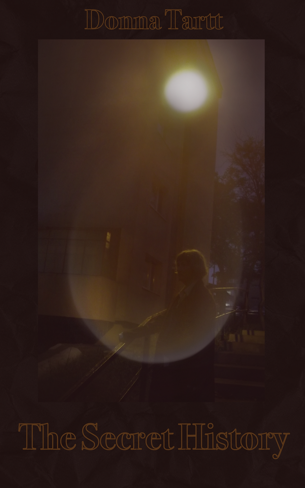
This is the final cover that I decided on. In this post I will give more details to how I ended up with this image.
Me and my mother tried to go take more photos on another day, but unfortunately as soon as we got to the location it started raining heavily so I decided to stick with the initial image. I wrote the title of the book and the author's name to keep it simple. I think I captured the idea I had in mind and the cover still manages to draw your attention without looking too over crowded. I made another version intially with a different font but it ended up being too hard to read so I swaped it out for this one. Even though I prefer this one in this context, I will include the other version here too.


In this variant, I went for a calligraphy font that I drew myself. I sketched it out on paper first in my sketchbook and then traced it digitally. I personally love writing in this type of font, but I can recognise how it can be hard to read. I think the second variant could maybe work as a poster or illustration but for a book cover it is very important that the font is legible because the title is the first impression you get of the book.
From this experience I learned that photo shoots need to be planned out better and that especially if you are shooting outside, the weather will always be unpredictable and I will keep that in mind for further projects.


Comments