research and planning - magazine analysis
- Teodora Frunza
- Feb 3, 2025
- 5 min read

Updated: Apr 22, 2025
In this post I am going to analyse two magazines that I have found online. I think doing this will help me get a better understanding of magazine conventions but also how I want my magazine to look like. I tried to choose two very different magazines, one is a more alternative and niche music magazine while the other one is a classic well-established mainstream fashion magazine.
Magazine 1 - Alternative Press
Alternative Press is an American entertainment magazine founded in Cleveland, Ohio in 1985 by Mike Shea. It focuses mostly on music and underground artists, but the title is not a reference to the alt rock music genre, it's referred to this magazine being an alternative to the local press. This is issue number 197 released in December 2004 and it features the band My Chemical Romance on the cover.
The Cover:

The overall colour scheme of this cover is very bold and definitely catches your eye, the bright pink + yellow texts create a striking contrast against the dark and moody cover photo. It feels very maximalist and in your face which can make potential readers feel distraught but it also catches their attention. The typical “alternative press” logo is covered in red spots that ties in with the cover of the album that the band released that year.
It does follow some of the magazine conventions that I have studied. The masthead stands out and it takes up a fourth of the space on top, it has a lot of cover lines, some are direct quotes from the magazine but also tag lines that reference different articles and themes covered in the magazine and it has some typical smaller elements like the bar code, price and date line.
With its unconventional colour palette and daring cover photo picturing the band members looking directly in the camera, I think it can be too distracting and bold for a more mainstream audience, but also very fitting for a more alternative audience who would be interested in something different than a typical magazines, which also seems to be the main point behind the magazines foundation.
Double - Spread 1:


The first double-spread I am analysing is the beginning of the My Chemical Romance related segment of the magazine.
As we can see, the colour scheme and fonts don't seem to resemble the cover much. The image is still dark and moody which is a constant element that we can see in the magazine, but this time the colour palette is warmer and even more saturated than the cover photo, with lighter + darker orange and brown shades.
The fonts might be different than the ones on the front cover but they are fitting for this image because the text is written in red, white and yellow. I really like how the text "Art intimidates life" (which is obviously a play on the classic phrase "Art imitates life") is spread out over both pages along with the image. The page on the right also contains a small paragraph related to this segment of the magazine + story and photography credits.
Double - Spread 2:


The second double-spread I decided to analyse covers more of the band's struggles with touring, sudden fame and substance issues.
This is a very text-heavy spread, but I like the dynamic inclusion of the two photographs, with one of them spreading over two pages which makes the spread look very cohesive. The text is laid out in two columns which makes including images easier. As for the overall colour palette, the images have a similar colour scheme with the first double-spread I mentioned, even though it is clear that these are taken at a different location with different lighting, that being the front row of a show that the band played.
Some other elements to keep in mind are the arrows pointing to the next paragraph/page, the fact that third paragraph begins with the first few words written in a bolder red font, which signifies that a different part of the story is starting and the vertical lines that split the text columns are in a teal colour that resembles the teal filter of the front cover image.
Magazine 2 - VOGUE
VOGUE is a monthly American fashion and lifestyle magazine founded in New York City in 1892 by Arthur Baldwin Turnure. From the beginning the magazine targeted the New York upper class. This issue titled "The Power of Women" was released in 2022.
The Cover:

This cover - especially in comparison with the Alternative Press one - is very simple and minimalistic. The colour scheme is limited, with the photo picturing Gigi Hadid being in black and white, and the text only being written in one font, either pink or white. Also, the colour pink is usually associated with the female gender, so it fits the focus on women of the magazine.
This cover also fits some conventions. The masthead and main cover line being pink attract the viewers first, which makes sense because they are the most important textual elements. There's three cover lines related to three different topics in the magazine that are split between thin white lines and are in a smaller font. The main cover image is very simple but effective, the model Gigi Hadid is looking to the side with her hair floating around her face in a messy style. She is also the first topic of the magazine alongside her sister Bella Hadid.
I think because of the minimalistic aesthetic of the cover, it gives off a very classy vibe and it seems fitting for an upper class audience but also approachable for anyone that doesn't fit the magazine's initial target demographic.
Double - Spread 1:
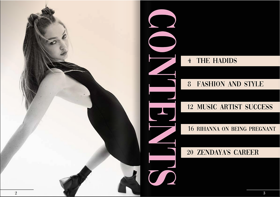
The first double-spread I chose features another photograph of Gigi Hadid and the table of contents. The colour palette and minimalist vibe is very consistent throughout the whole magazine.
On the left page the photograph of Gigi Hadid is also black and white like the cover, but the photo feels more daring and editorial. It's a full body shot with an interesting over top angle which creates a dynamic diagonal line. Also, the model Gigi Hadid looks directly at the camera, which makes it seem like she is looking at the readers which makes them see her from a more personal and direct perspective. This is fitting because by turning the page, the readers can start reading her segment of the magazine, so the image almost seems to prepare them for that.
The table of contents is also laid out in a simplistic style, with the word "CONTENTS" spelled in all-caps in the colour pink being positioned vertically and the main segment accompanied by their respective page number set in a column in simple white boxes against the black background.
Double - Spread 2:

The second double-spread i decided to analyse is part of the "Music Artist Success" segment. It features photographs of two successful women in music, Lizzo on the left page and Doja Cat on the right page.
Both pages include a quote by each individual artist related to their success in the music industry. Both images individually take up the whole page, and they are both black and white photos.
I think personally I would prefer if the text was in the same pink shade present on the other pages because it would be easier to read and it would make the main colour palette even more consistent.
Conclusion:
I think this post made me see just how different these two magazines are. It feels like they are at opposite ends of the minimalist - maximalist spectrum. I usually prefer a more maximalist approach in art in general, but this analysis also showed me that I lean towards a more maximalist approach in magazines too :).
Sources:


Comments